What makes a dental website actually convert?
It’s not just design.
Many clinics invest in a modern-looking website, only to find that bookings don’t improve. The traffic is there, but patients aren’t taking the next step.
In 2026, the difference between an average site and a high converting dental website comes down to structure, clarity, and user experience.
The best-performing clinics don’t just look good online. They guide patients toward action.
In this guide, we’ll explore:
- What defines the best dental website layout today
- How dental website UX impacts patient decisions
- The key elements of a high-performing dental website structure
- A practical dental website redesign checklist
Let’s dive in.
Why Website Layout Matters More Than Ever
Patients don’t read websites.
They scan.
When someone lands on your site, they’re quickly trying to answer:
- Can this clinic help me?
- Can I trust them?
- How do I book?
If your layout doesn’t make those answers obvious within seconds, they leave.
This is why dental website conversion optimisation is now a core part of dentist website design in Australia.
The layout isn’t just visual, it’s functional.
What the Best Dental Website Layout Looks Like in 2026
A strong dental website design in 2026 follows a clear, predictable structure that reduces friction.
Here’s what that typically includes:
1. A Clear, Conversion-Focused Homepage
Your homepage should do three things immediately:
- Communicate what you offer
- Build trust
- Direct patients to book
Key elements:
- A strong headline (e.g. “Family & Cosmetic Dentistry in [Location]”)
- Visible “Book Appointment” button
- Contact details above the fold
- Trust signals (reviews, affiliations, credentials)
The best layouts remove guesswork.
Patients shouldn’t need to scroll to figure out what to do next.
2. Simple, Logical Navigation
Navigation plays a major role in dental website UX.
If users can’t find what they need quickly, they leave.
Best practice includes:
- Clear menu structure (Home, About, Services, Contact)
- Dropdowns for specific treatments
- Minimal clutter
A clean navigation system supports both usability and SEO.
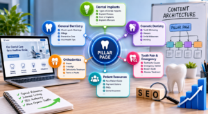
3. Dedicated Treatment Pages
One of the most important parts of a strong dental website structure is having separate pages for key services.
Instead of listing everything on one page, create dedicated pages for:
- Invisalign
- Dental implants
- Teeth whitening
- Emergency dentistry
This improves:
- Search visibility
- Patient understanding
- Conversion rates
It’s also a key part of dental website layout best practice.
4. Strong Calls to Action Throughout
A high converting dental website doesn’t rely on a single booking button.
It uses consistent prompts across the site.
Examples:
- Book a consultation
- Call our clinic
- Request an appointment
These should appear:
- At the top of pages
- After key sections
- At the bottom of pages
Clear direction reduces hesitation.
5. Trust Signals in the Right Places
Patients need reassurance before they book.
That’s why the best dental website design examples consistently include:
- Google reviews
- Before-and-after cases (where appropriate)
- Dentist credentials
- Real clinic photos
These should be placed strategically, not hidden on one page.
Trust should be built as the patient scrolls.
6. Mobile-First Design
Most users visit dental websites on their phones.
That means your layout must prioritise mobile usability.
A strong mobile experience includes:
- Click-to-call buttons
- Easy-to-tap booking options
- Fast loading speeds
- Simple scrolling
This is a non-negotiable part of modern dentist website design in Australia.
7. Fast Load Speed
Speed directly affects conversions.
If your site takes too long to load, patients won’t wait.
Fast websites:
- Improve user experience
- Support SEO
- Increase enquiry rates
Optimising images, hosting, and code can significantly improve performance.
Common Layout Mistakes That Hurt Conversions
Even visually appealing websites can underperform if the structure isn’t right.
Here are some common issues:
- Hidden or unclear booking options
- Too much text without direction
- Overuse of stock images
- Confusing navigation
- No clear treatment pathways
Fixing these often leads to noticeable improvements without increasing traffic.
Dental Website Redesign Checklist
If you’re reviewing your current site, this dental website redesign checklist can help identify gaps:
- Is your booking option visible on every page?
- Does your homepage clearly explain what you offer?
- Do you have dedicated pages for key treatments?
- Is your site mobile-friendly and fast?
- Are trust signals visible throughout the site?
- Is your navigation simple and intuitive?
- Are your calls to action clear and consistent?
If you answered “no” to several of these, your website may be limiting your growth.
The Role of UX in Conversion
Good design attracts attention.
Good UX drives action.
Strong dental website UX focuses on:
- Reducing friction
- Guiding users step-by-step
- Making decisions easier
This is what turns visitors into patients.
It’s also why many clinics are shifting focus from just “design” to dental website conversion optimisation.
The Key Takeaway: Structure Drives Results
A modern website isn’t just about aesthetics.
It’s about performance.
The best dental websites in 2026 focus on:
- Clear layout and navigation
- Strong booking pathways
- Trust-building elements
- Mobile-first design
- Fast, seamless user experience
When these elements work together, your website becomes a growth tool—not just a digital brochure.
Ready to Build a High-Converting Dental Website?
Let’s help your clinic turn more visitors into booked patients.
At Dental Rank, we specialise in dental marketing across Australia, helping practices build high-performing websites designed to support more enquiries and consistent patient growth.
From strategy and structure to full dental website design 2026 upgrades, we focus on what actually drives results.
Schedule a free consultation today if you’d like to see how improving your dental website layout could increase your clinic’s bookings.